MINI CAMPAIGN
MINI CAMPAIGN
MBFS
UX DESIGN
UI DESIGN
ABSTRACT
MBFS was in the need of a basic maintenance page that would simply redirect users away from the main home page because there was a massive infrastructure merger. Their typical maintenance page is a plain industry-standard utility. Unfortunately, this maintenance page caused a bit of an uproar and tons of negative feedback due to it having the effect on times tables and factors towards account standings.
/Finished Composition
/TECH & SOFTWARE
tech :: HTML 5; CSS 3; JAVASCRIPT; BOOTSTRAP 4
software :: SKETCH; INVISION; ADOBE PHOTOSHOP; VISUAL STUDIO CODE
THE PROBLEM
The old maintenance page simply tells the user that the page is down for maintenance and to come back soon. A major issue is that most of the users to the site are attempting to manage their debt in some frame or fashion and having the site down for an extended time isn't appropriated in any way by company business rules. In other words, the site being down isn't considered a good excuse to neglect to handle financial responsibility. Even though we can't solve that problem we can appeal to other standards while also helping them with how to handle priorities. We turn to Qualtrix, a survey service geared for obtaining customer feedback, to substantiate a user needs assessment.
USER NEEDS

/frustrated user
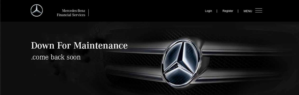
/old maintenance site
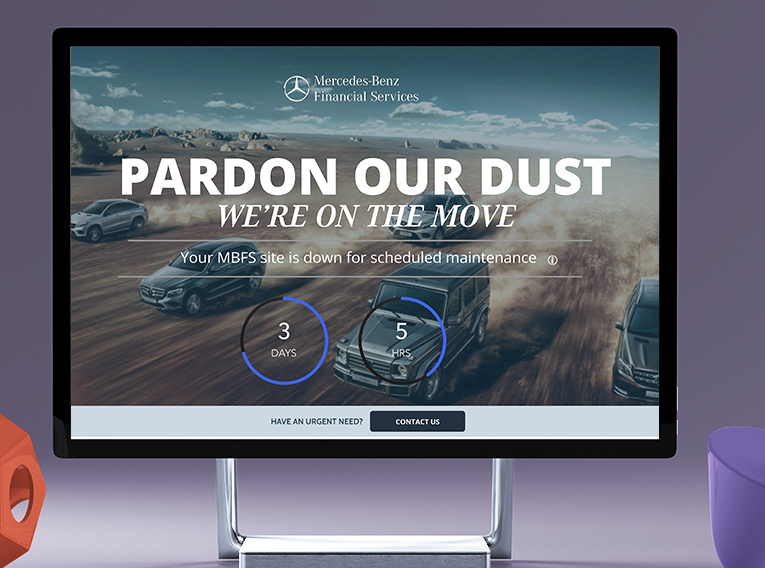
"I want to see something more than just a down for maintenance message."
THE PROCESS
This project called us to brainstorm on top the basic contention which was already utilized and, of course, build on top of that. What came out of that brainstorm session is something contemporary and we found a new and interesting twist which could take the world of the boring maintenance pages into a new direction. We combined our brainstorm with the items allocated in the needs assessment acquired from the survey and noticed that this witty, younger audience called for something more efficient and insightful. The reason being is because many of the customers log on to the site to handle important time-sensitive issues. Having the website down halts that process and, in turn, cripples the user experience all together.
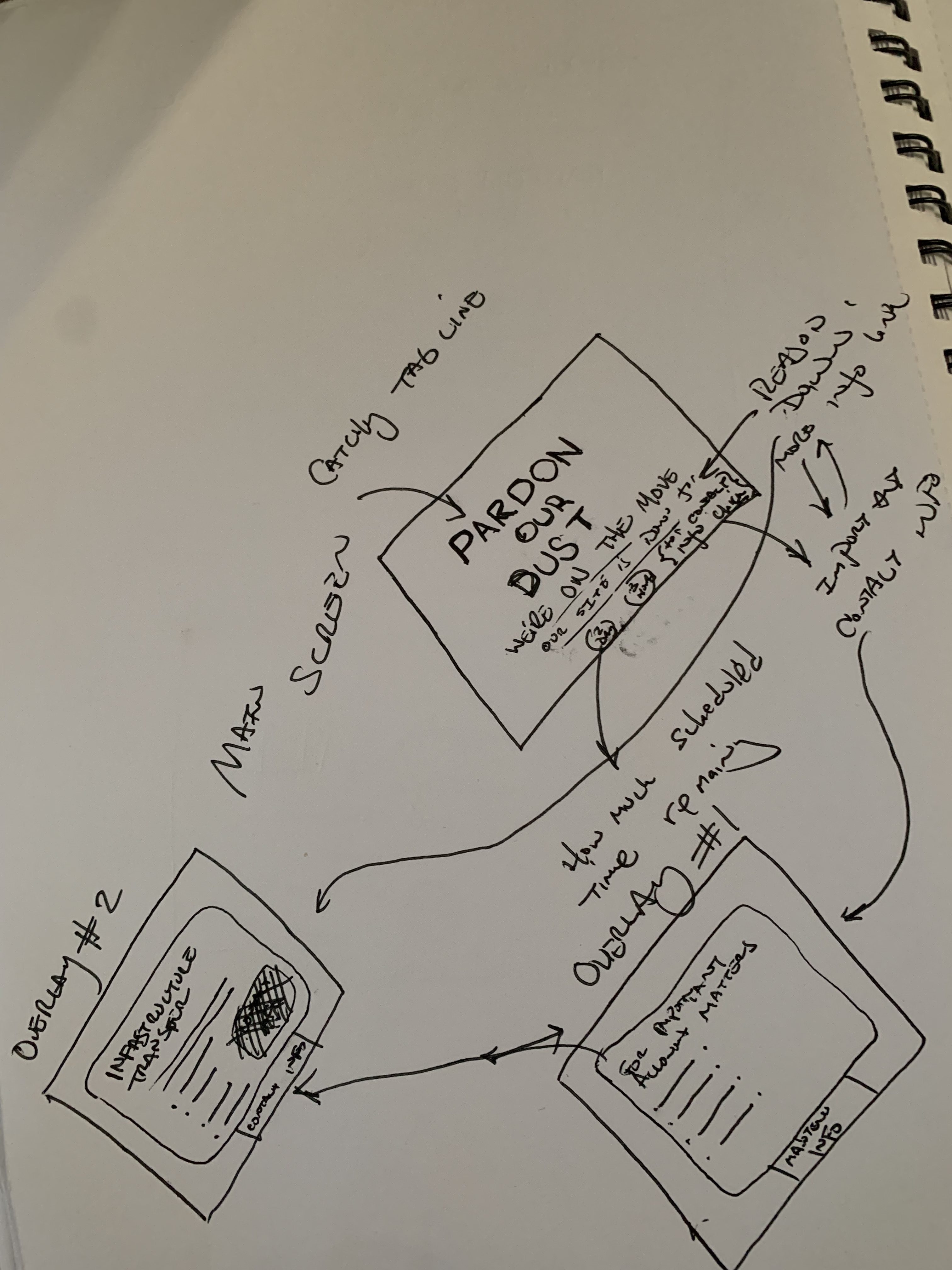
/concept sketches
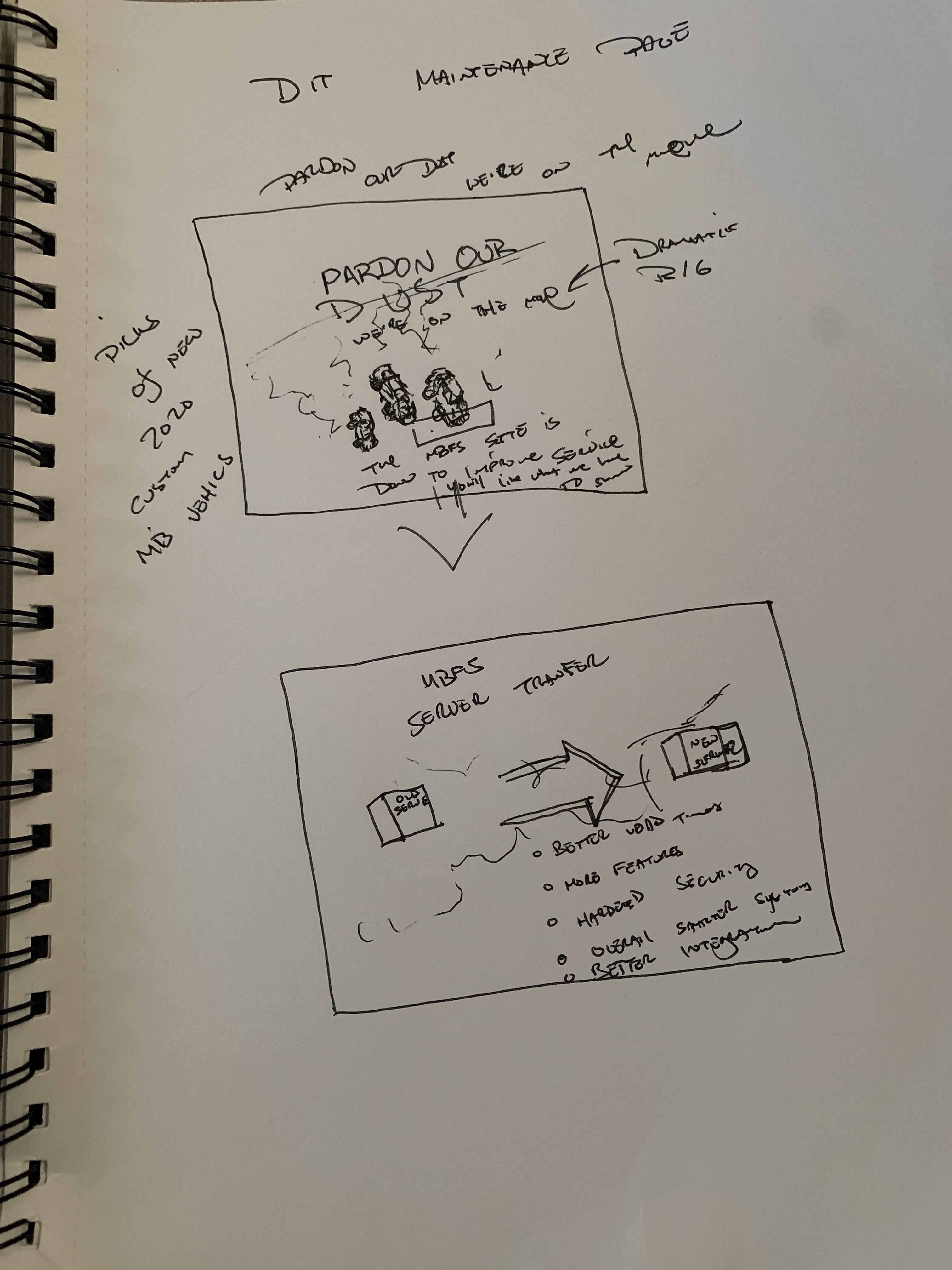
/concept sketches
THE SOLUTION
After our brainstorming session, we turned to Sketch and Invision to create hi-fidelity wireframes because we wanted to focus on the feel for the user interface. We wanted to make sure that we covered all angles and finalized on a simple design with hefty typography that touches our user. We were really concerned with informing the user, attempting to address and communicate their immediate needs, and if there is a concern, provide instruction to gain contact. This project, within its own right, has become an unofficial campaign because it broadens something simple to support the customer's standing on the company's products and services. Furthermore, It addresses, and advertises, that we understand the need that a customer will rely on this website to handle important matters and works to soothe their frustrations. It also brings awareness to the brand because it gives the attentiveness of an intelligent and complete design that fulfills many facets of customer service and allows the shared brand experience to communicate facilitation of care, trust, and attentiveness.
Mini-Campaign Architecture
- Brand Awareness
- Shared Brand Experience
- Emotionally Impactful
- Information Gateway
- Advertises Commitment
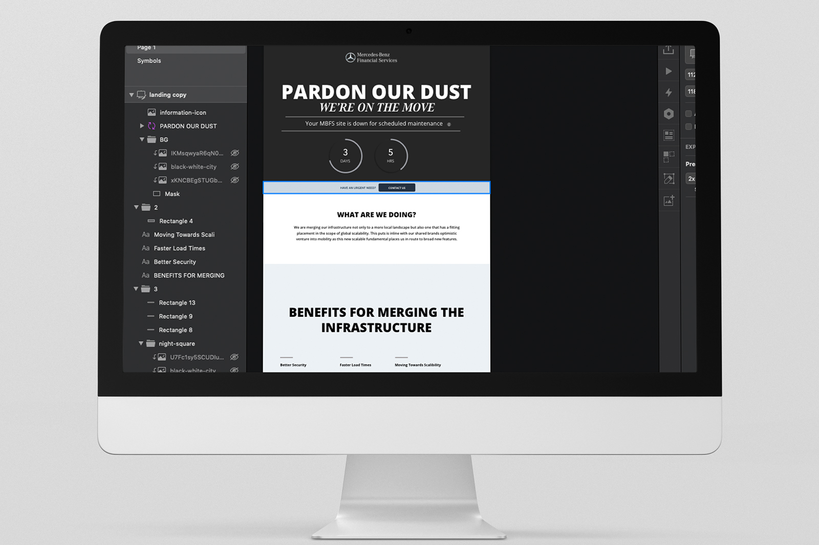
/hi-fidelity wires
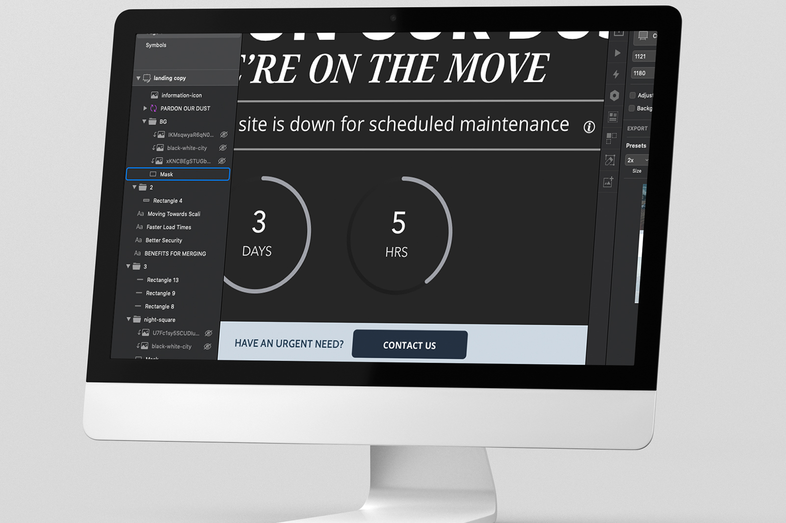
/hi-fidelity wires
AMAZE
INTERACTIVE STUDIOS
ADDRESS | Phone | Message
QUICK NAV
HOME
ABOUT
PROJECTS
BLOG
CONTACT
REQUEST SERVICES
NEWSLETTER SUBSCRIPTION